UI documentation gap analysis
NextDNS Setup Screen
Redesign
Identifying and fixing a security documentation gap in a real product interface
Source
NextDNS mobile app — Setup screen (nextdns.io)
Deliverable
Redesigned UI screenshot with security warning and annotated color system
Tools applied
Forum research, documentation gap analysis, Special Notices conventions, Python, Pillow
01 — The Problem
Sensitive data, no warning
The NextDNS Setup screen displays a user's Profile ID — a sensitive credential
that grants full access to their DNS filtering configuration — across four endpoint formats,
with no indication that the data is sensitive or should be protected.
A user sharing a screenshot for support, a common practice, exposes their account to
unauthorized access. This is a documentation gap, not a UI bug.
The data is correct. The context is missing.
Forum research confirmed the risk: a warning post in the NextDNS community raised the
concern, and two recent posts confirmed it — users sharing Setup screen screenshots
with their Profile ID fully visible.
01
Missing security context
No warning appears before sensitive data is displayed. A user has no indication that the Profile ID is a credential, not just an identifier.
02
No visual hierarchy for sensitive values
The Profile ID and all derived endpoint values appear in the same style as static infrastructure addresses. Nothing distinguishes sensitive from non-sensitive data.
02 — Before & After
The redesigned screen
The original screen presents the Profile ID and all endpoint values with no security context.
The redesigned screen inserts a yellow Caution banner at the exact point where the Profile ID
first appears, and recolors all sensitive values to match the warning signal.
Original
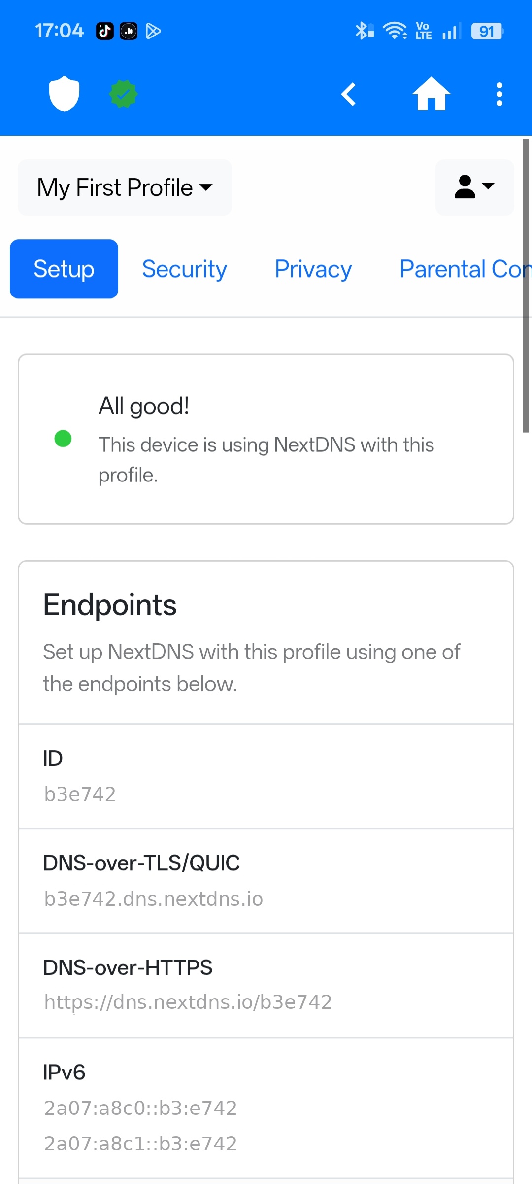
Profile ID and endpoints displayed with no warning or visual distinction.
Redesigned
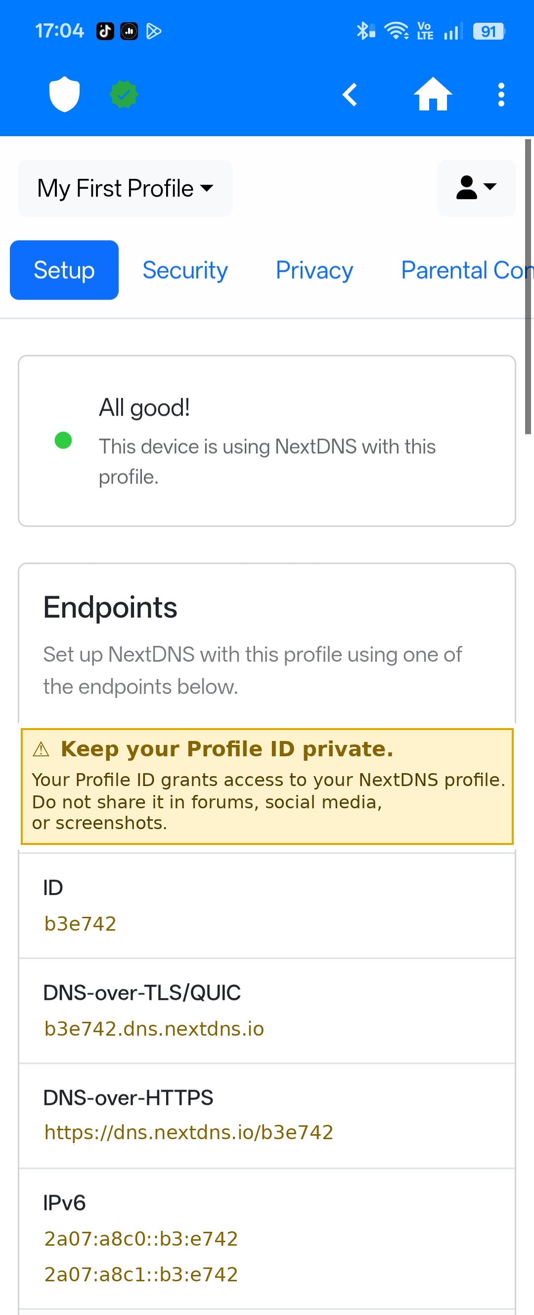
Yellow Caution banner inserted above the data. All sensitive values recolored to match.
Yellow (Caution) was selected based on Special Notices conventions: the standard
signal for potential harm to data or equipment. The color is applied consistently across all
sensitive values so the warning signal carries through the entire screen.
03 — The Process
How I identified and solved the gap
1
Identified the gap through forum research
Found a warning post in the NextDNS community raising the concern. Two additional recent posts confirmed it — real users sharing screenshots with their Profile ID fully visible.
2
Mapped two documentation failures
Missing security context before sensitive data is displayed, and no visual hierarchy to distinguish sensitive values from static infrastructure addresses.
3
Selected yellow based on Special Notices conventions
Yellow (Caution) is the standard signal for potential harm to data or equipment. Applied consistently so the warning signal is meaningful, not decorative.
4
Recolored all sensitive values to match the banner
Profile ID and all derived endpoint values share the same color as the warning banner — creating a single, consistent visual signal throughout the screen.
5
Executed the edit in Python with Pillow
Canva requires a public HTTPS URL and could not access the local screenshot. Used Python's Pillow library to insert the banner and recolor the sensitive values with pixel-level precision.
04 — Key Skills Demonstrated
What this project shows
Forum-based gap analysis
Special Notices conventions
Visual risk communication
Audience-centered structure
Screenshot annotation
Plain-language security docs